Think back, real hard, to the time when Music Television actually played music videos and Chia Pets were common gifts. A time before multi-layer graphics with alpha channels and fancy compression. A time, yes, even before you had a “clip art” library on your “Macintosh.” In the early days of personal computing, screen graphics were made by carefully arranging the symbols and characters known as American Standard Code for Information Interchange (ASCII) into a modern-day mosaic.
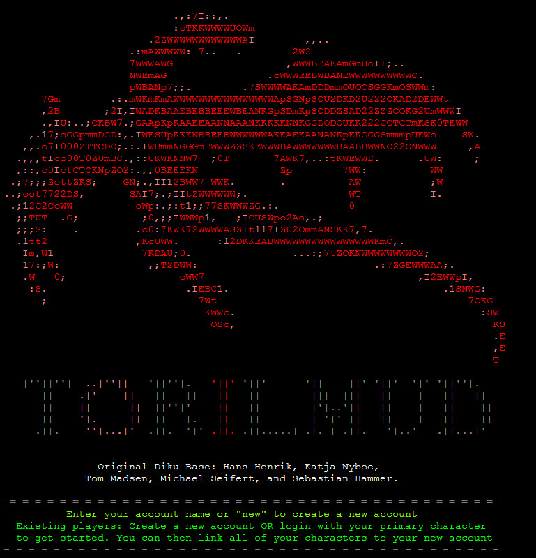
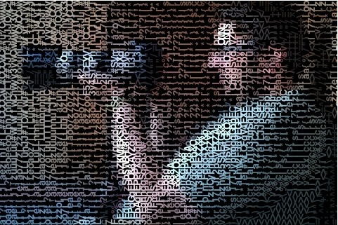
The above graphic is actually an updated version (color!) of the intro screen I saw when jumping on Telnet to play my Multi-User Dungeon game, Sojourn/TorilMUD. Though (kids, avert your eyes for a second) to be honest, this was the only “graphic” in the whole game (you can look now, younger gamers).
Surprisingly, ASCII art never really died. Whether through nostalgia, the now-a-novelty factor, or a lasting and genuine appreciation of the technique, the mosaic of the late twentieth century still survives. Bit Rebels has a great post about some ASCII art made on a typewriter – quite a feat. Here, we’ll take a look at a few of the more impressive examples online.
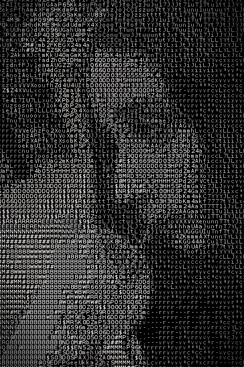
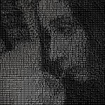 You can Google “ascii image converter” to find a slew of programs that will turn your everyday photograph into a unique piece of digital art. This one from flickr stood out to me for its contrast and the general clarity of the characters.
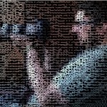 This piece is not quite so crisp since it uses less “pixels” (characters), but you can see how the variation of the characters’ colors does more than the characters themselves to define the image. On a purely geek note, notice how the use of a sans-serif font and heavier font-weight add to the blurred or smudged feel, like a watercolor.
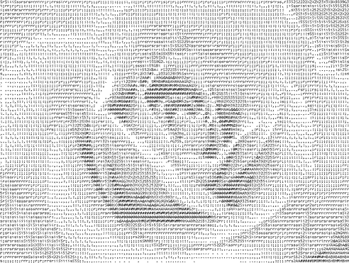
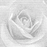 One of my personal favorites, this photo-turned-ASCII-art relies more on subtle shading effects to create its image. It almost feels like a pencil sketch. In a higher resolution, this could be background-worthy.
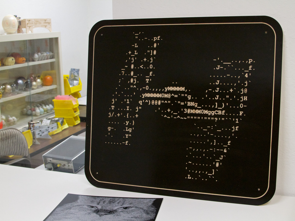
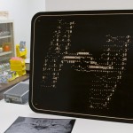 You can’t talk about geek art without mentioning Star Wars. I particularly love how simple it looks enlarged, yet how complex it looks in miniature. There’s actually a site detailing the making of this wall-plaque etching. Click on the larger photo when you’re done here to learn more.
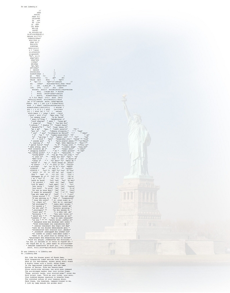
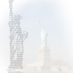 Not only would it take forever to make the Statue of Liberty in ASCII by hand (as was done here – no converter), every character in this piece, if typed in the existing order with proper line breaks, spells out the script for a simple program that prints the text at the base of Lady Liberty. Oi. I’m not sure I would have the patience to make something like that. But it’s beautiful.
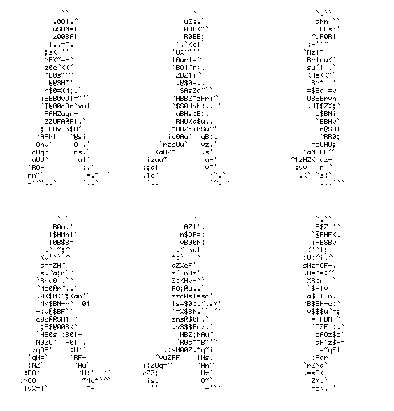
And to leave you with a smile, check out the ASCII Walking Man that’s floating around the interweb. I just get a kick out of watching him. It takes vision to make good frame-by-frame animation. Especially with ASCII.
Did you enjoy this collection? Do you have any ASCII art you’d like me to put up here?
Comment and share to keep the discussion going. And subscribe via Email or RSS if you like this blog!

Recent Comments